Artist statement:I've been interested in photography for years so this exercise was exciting for me. I've stocked up on an abundance of pictures I've taken previously and was able to use them to experiment with different effects and techniques like the rule of thirds or the golden spiral. I went into this confidently because I knew I would definitely have the images in some form. It wasn't until after exploring new ways of cropping and editing that I realized I could make them look much more intriguing. The architecture must have been the most difficult for me because it's probably what I most enjoy capturing. It was difficult to change the perspective of them as I usually just take it straight on. I love symmetry and have a hard time straying from it, but I now realize that it can add a lot of new focal points to a composition. I am very pleased with the second attempts as they show new views and more clean cut lines.
1 Comment
artist statement:Over the course of about 3 weeks, I had taken pictures of the last few sunrises and sunsets of summer. Through editing, I made the colors more vibrant and beautiful. The main subject matter was of course the sky and the silhouettes it shows. I knew from the start I wanted to use soft pastels. I love the way you could get the colors to blend and work together. I wanted the main focus to be on the sky so I made sure to make the silhouettes as dark as possible. In my personal opinion, there is no greater meaning to this piece than letting viewers observe. While making this, I ended up using very bright colors that I would have never used before. Overall I am pleased with the way it turned out and what it shows.
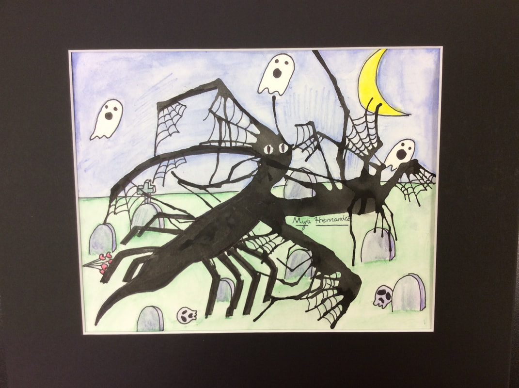 artist statement: My artwork is a composition created from an ink splat. To me, the ink ended up looking like a ghost or ghoul. To complete this I turned the background into a graveyard. I used very simple lines and colors to imitate a cartoon like style. I didn’t include more than five colors in the background, which I think focused attention on the ink splat creature. The work doesn’t have an ‘all answer’ idea or meaning behind it, but I guess it could represent going through a rough patch in life, while still knowing it gets better. In the end I wanted the interpretation to be open, and i think that because of the child like monster it includes, it can be taken many different ways. To be honest I wish I had added more detail to add a small sense of realism. To conclude, I’m content with the way it turned out looking, and would take on a project like this again.
 Artist statement: The title of the artwork is, The Collective. To create this piece. I used scrap paper, ink, graphite, markers, and charcoal. In my opinion, the piece shows freedom to create and how you can make different materials work together. The artwork is a collection of organic lines and materials. My goal for this piece was to force people to not only see the individual items but to see what they make when they overlap, blend, and combine as one. This collection of shapes, lines, textures, and values has taught me to be indifferent when it comes to organization.
|
AuthorMy name is Mya and I'm a freshman high school student. I enjoy drawing, design, sculptures, and photography. This site is a reflection of my creative work. Archives
December 2017
Categories |
 RSS Feed
